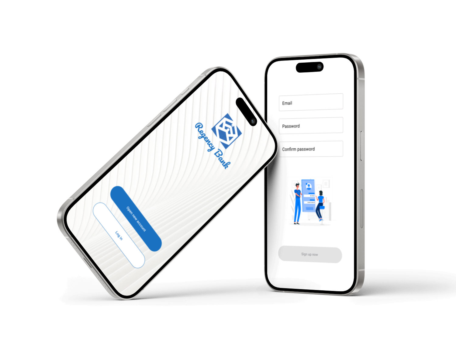
The app enables customers to select and set up a personal bank account entirely online, eliminating the need for in-person visits.
This project was created as part of the Google UX Design Certificate.
ROLE
I served as the sole UX designer, overseeing the entire design thinking process from initial research to the final high-fidelity prototype.
DURATION
3 weeks
Project Overview
Problem
Traditional banking requires physical branch visits, excessive paperwork, and long processing times, making it inconvenient for modern users with busy lifestyles. Many people seek a more efficient, digital-first solution to manage their finances without unnecessary delays.
Solution
The goal of this project is to create a user-friendly digital banking solution that simplifies account opening and financial management. Aiming to enhance accessibility, reduce friction, and deliver a seamless banking experience.
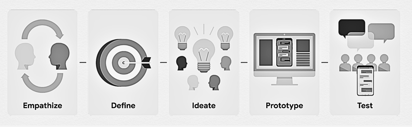
Design Thinking Process
In this project, I adhered to the design thinking process, ensuring that my designs effectively address user needs at each phase.
Research Conducted
I found qualitative research methods most useful, consisting of surveys and interviews, to gain insights into our primary users' needs and challenges:
Develop user stories to understand users' painpoints and goals
Translate user stories into user flows to visualise how users navigate the platform
Designing a wireframe
Creating a prototype
Develop the website
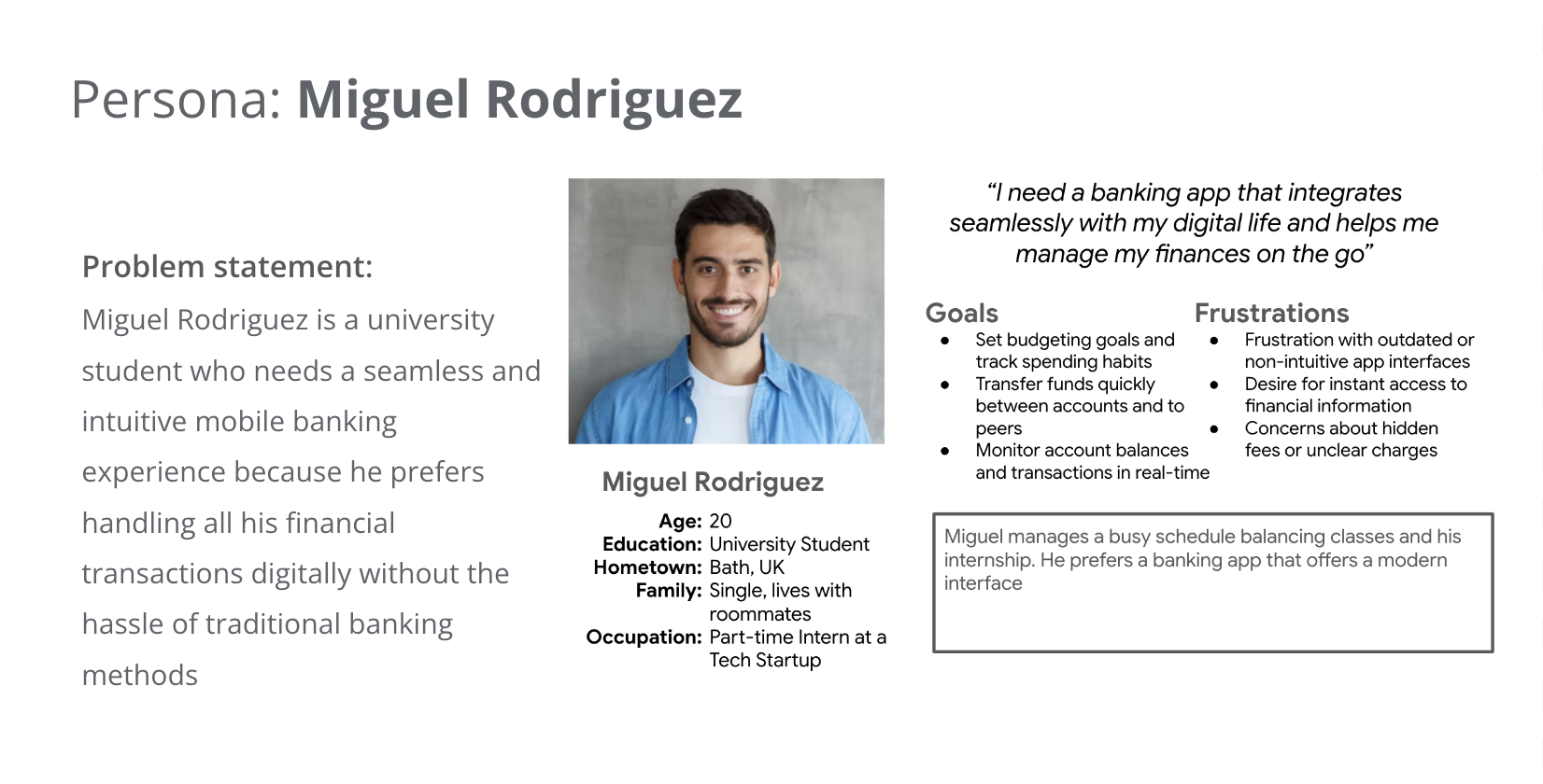
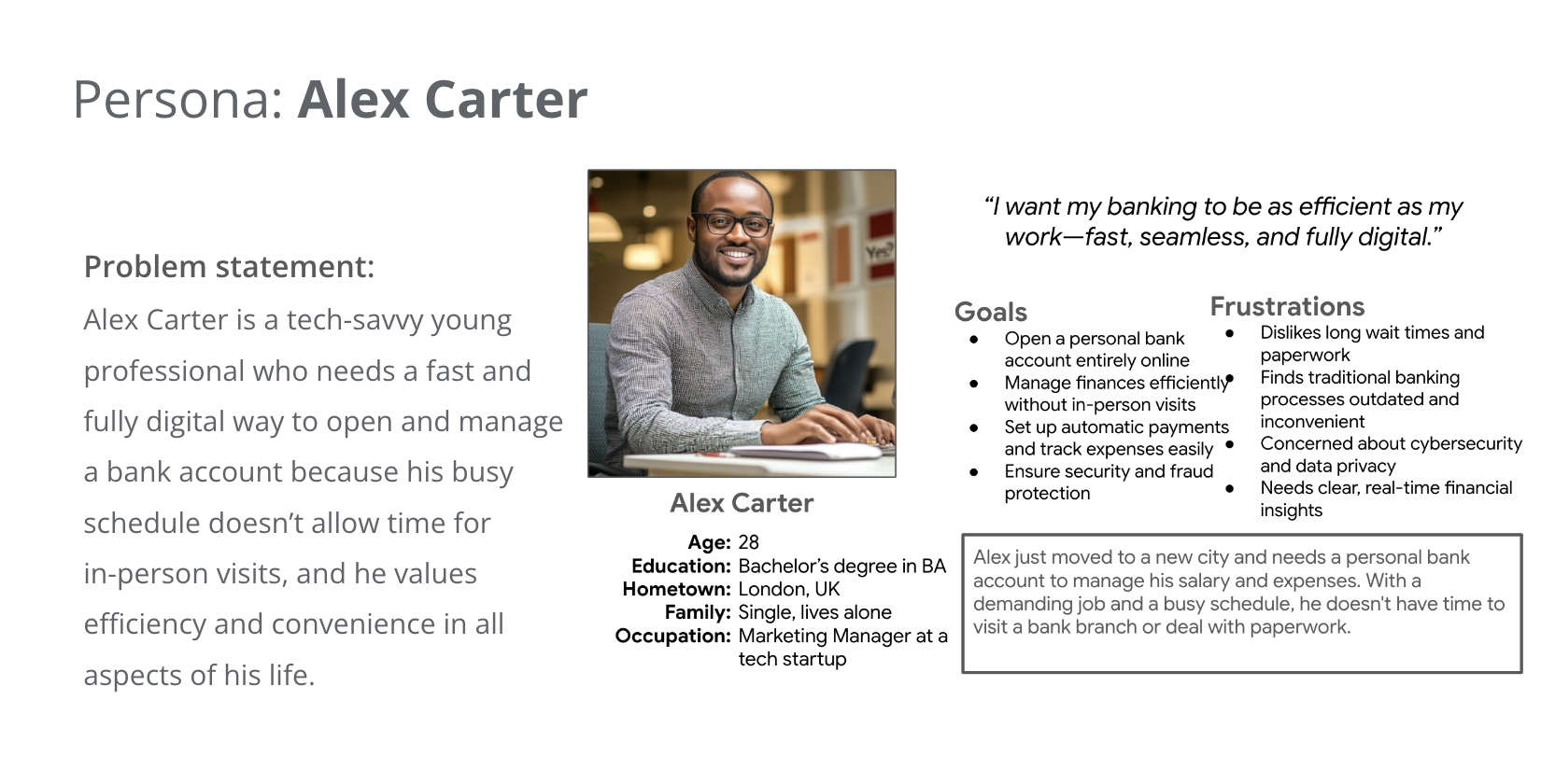
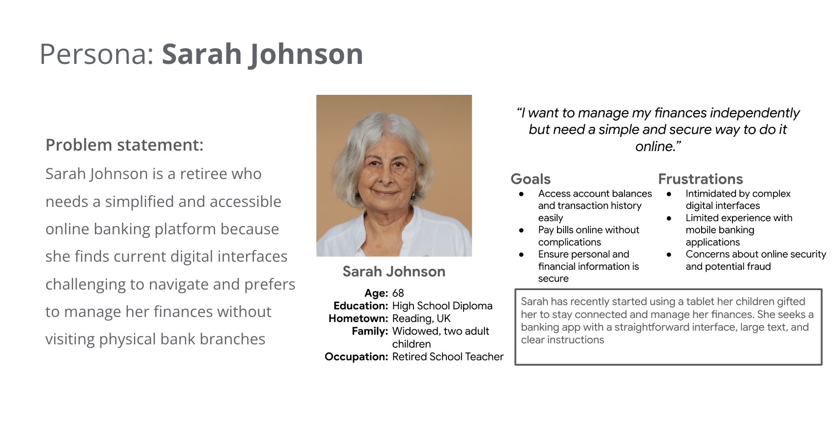
Based on these findings, I created three personas who are our target users:
Competitive Audit
To learn more about how competitors design similar products or serve similar users, I created a competitive audit. The following are learnings from my competitive audit:
Simplify the sign-up process:
Recognising that some competitors have cumbersome onboarding procedures, I can streamline the
sign-up process to be more user-friendly. Implementing features like mobile number and
selfies for identity verification can expedite account creation while maintaining security
User experience:
Adhering to best practices in mobile app development, I should focus on clutter-free screens,
reduced cognitive load, and simple navigation. Ensuring that frequently used controls are within
thumb's reach and maintaining a minimum contrast ratio of 4.5:1 between text and background will
improve
usability
Incorporate financial education:
Providing comprehensive financial education resources within the app can empower users to make
informed decisions, addressing a gap identified in the market
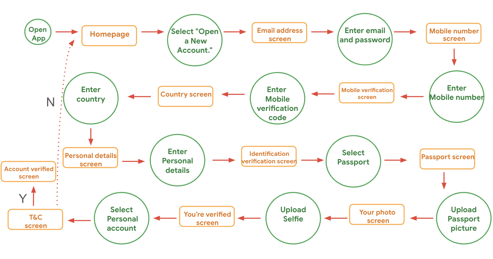
Preparing the Journey
Before prototyping, I started with an outline of the user flow to have an idea of how users will move through the product to achieve their goals.
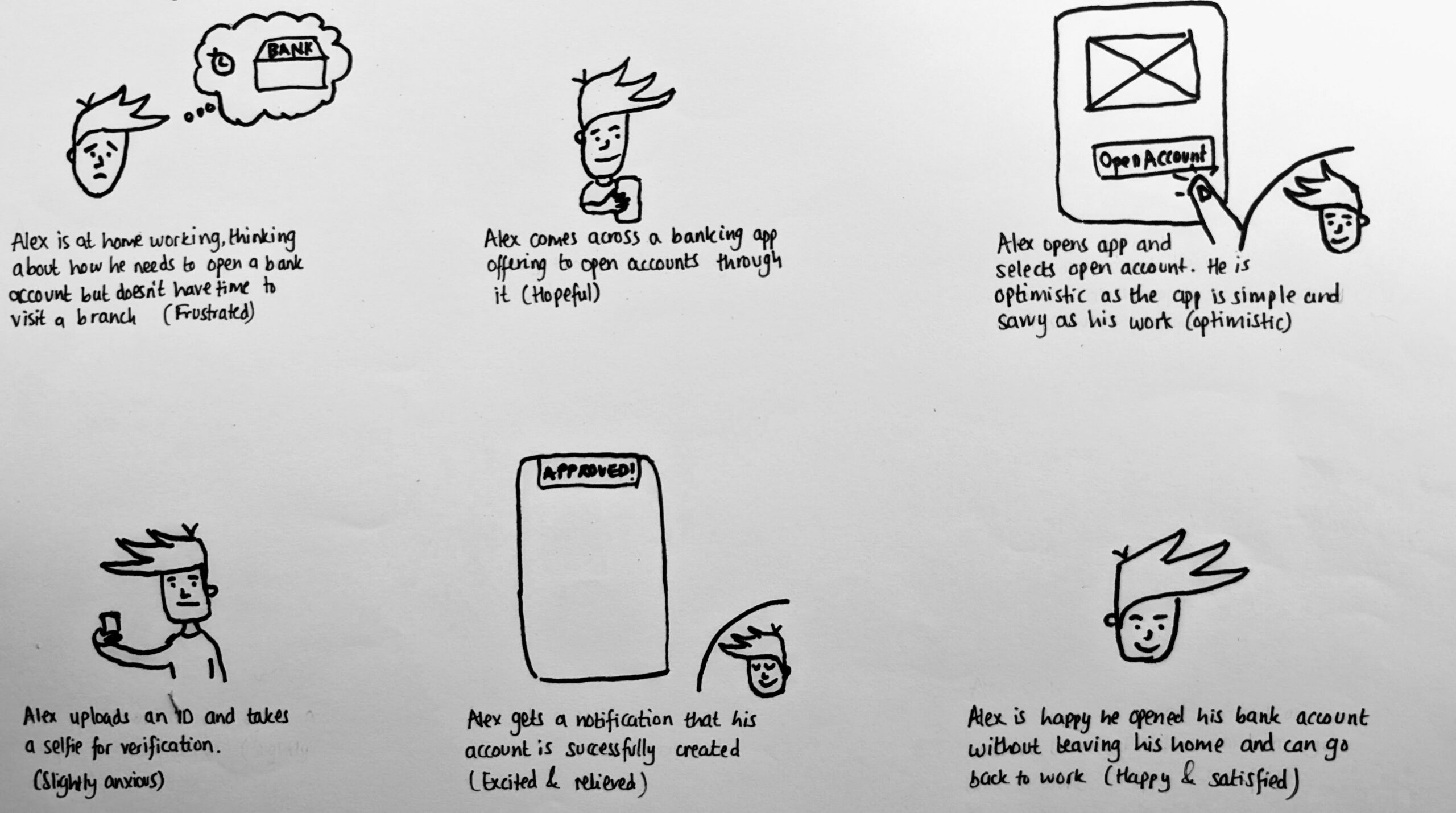
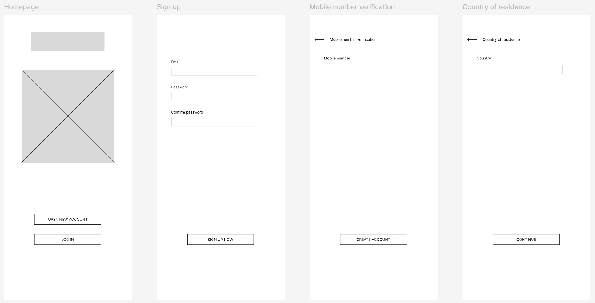
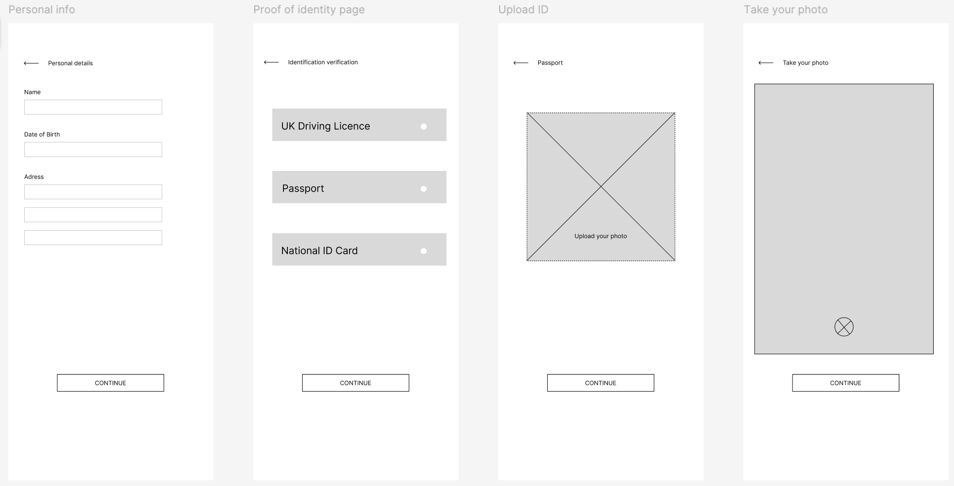
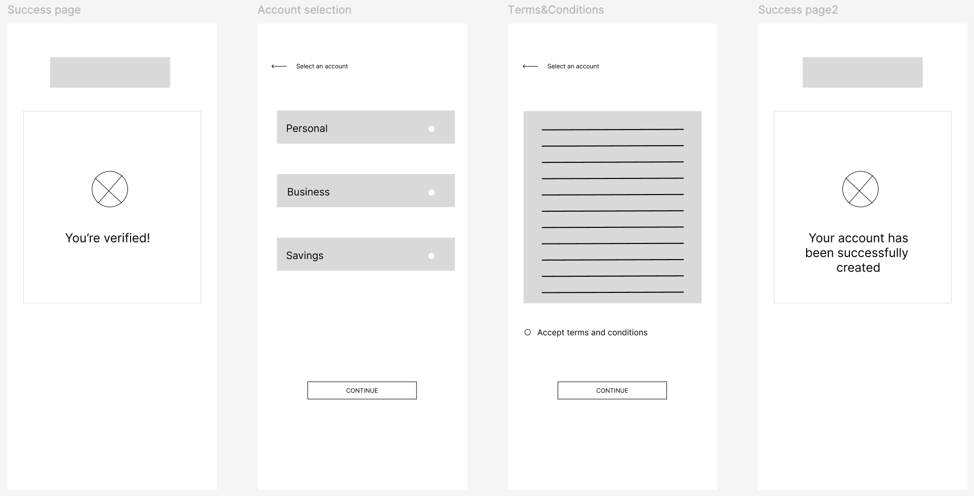
Wireframes
Once I identified some of the key screens, actions, and decisions in the user flow; I worked up a more detailed prototype that simulated this:
Results of User Testing
After creating my prototype from low fidelity wireframes, I prepared a usability test with a group of 7 participants to gather feedback to use for the next design iteration. Key findings from usability testing showed that:
Need for more prominent Call-to-Action (CTA) buttons:
Users found it challenging to identify the primary actions due to poorly distinguished CTA
buttons. Enhancing the prominence of these buttons through strategic placement, size, and color
contrast will guide users effectively
Need visual barriers:
Users didn't like the uniform color scheme across a page. Adding visual barriers will make it
easier to understand and navigate as well as keeping the designs neat and organised
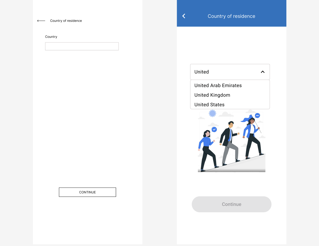
Absence of dropdown for country selection:
The lack of a dropdown menu for country selection complicates the input process, making it
time-consuming and prone to errors. Implementing a dropdown menu will streamline this process,
allowing for quick and accurate selection
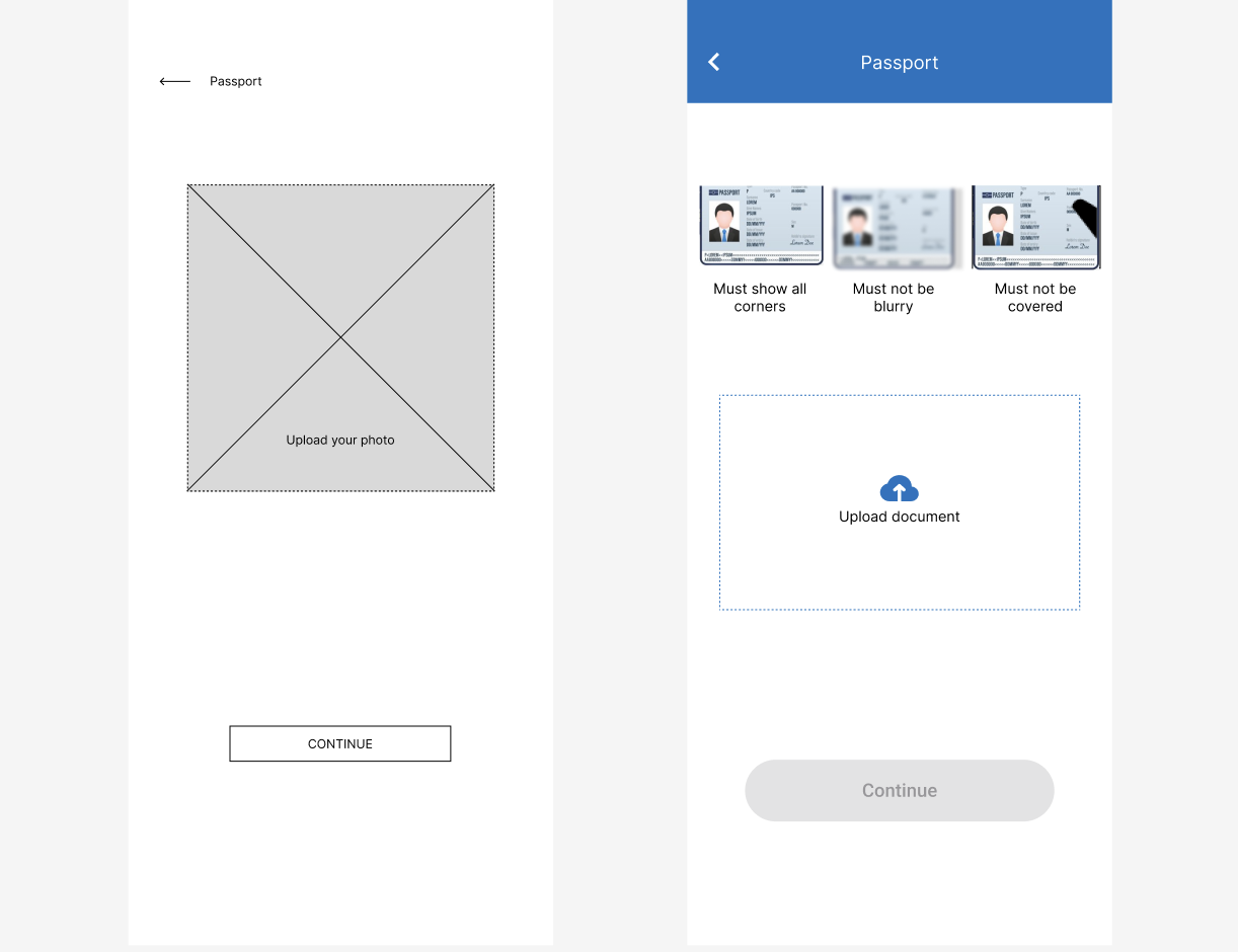
Unclear instructions for photo uploads:
Users encountered difficulties due to unclear requirements when uploading photos, leading to errors
and frustration. Offering clear, concise, and step-by-step guidance during the photo uploading
process will reduce errors and enhance user confidence in completing this task
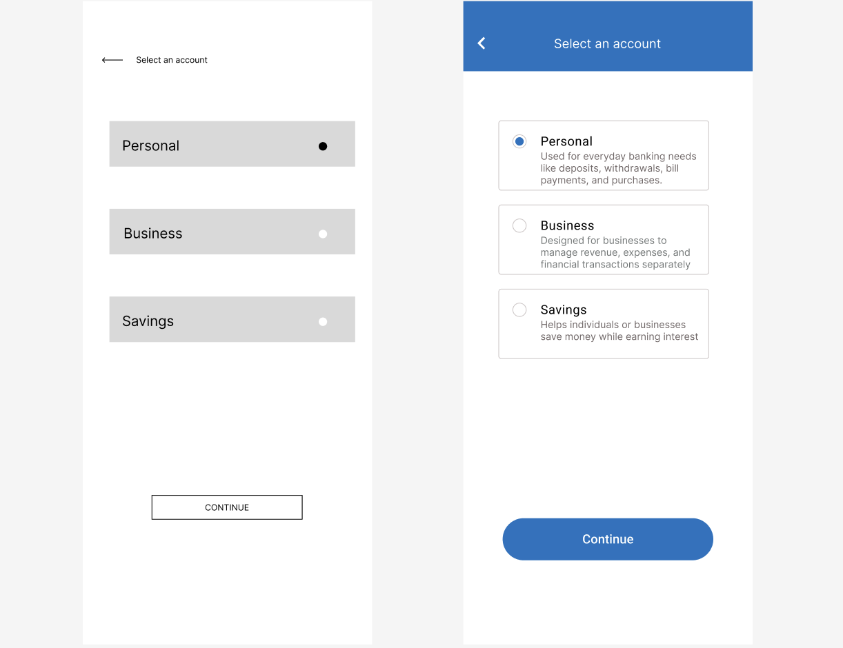
Insufficient information on banking account types:
Users have reported a lack of clear information distinguishing different types of banking accounts.
This ambiguity can lead to confusion and misinformed decisions. Providing comprehensive and easily
accessible information on each account type will empower users to make informed choices that best
suit their financial needs
Design System
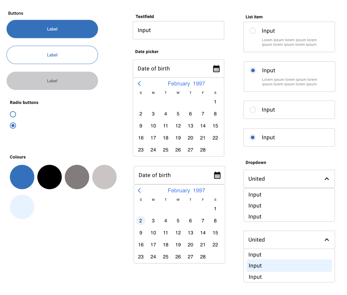
I've added a design system to my portfolio to streamline my design process and ensure consistency across projects. By documenting the visual elements such as fonts, colors, layouts, and iconography, I can save time and make informed design decisions without starting from scratch each time. Using tools like Figma, I've created a sticker sheet to house my reusable components, and I've also integrated external UI kits to enhance my designs, making it easier to maintain a uniform user experience across different devices and platforms.
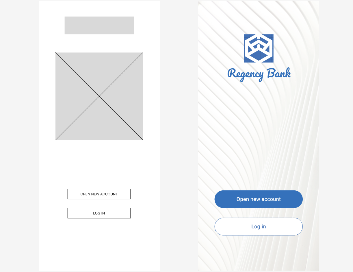
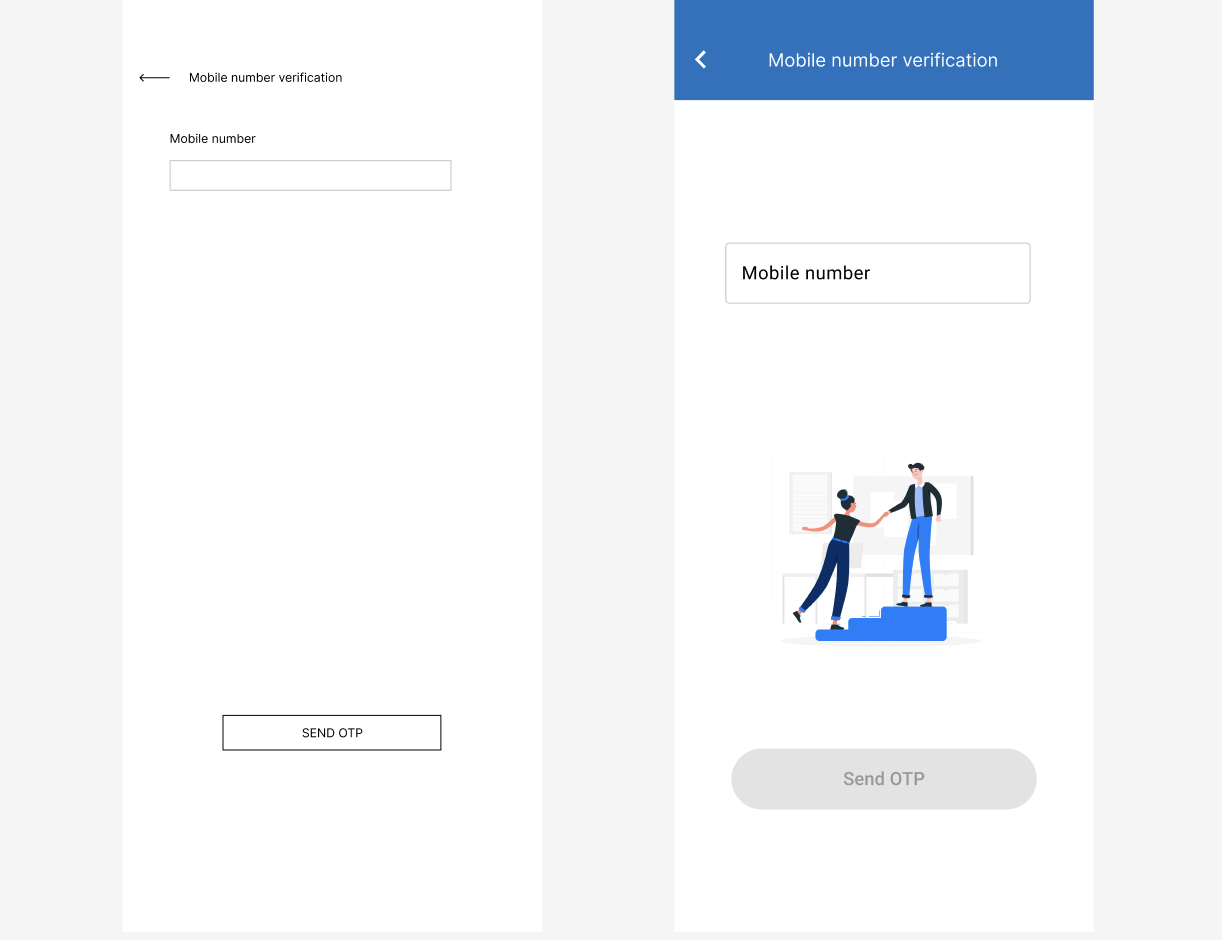
Final Polished Design
Conclusion
Throughout this project, I learned the significance of user-centered design and iterative testing, which are crucial for enhancing the user experience in banking applications.
Future steps will focus on incorporating features like personalised financial insights and budgeting tools. Continuous user feedback will guide these enhancements, ensuring my app evolves with user needs. This case study demonstrates that a structured, empathetic design approach fosters user trust and satisfaction in digital banking platforms.